Getting Started
Getting Started
Create your first managed PixMold project and build a reusable UI element.
What PixMold is for
PixMold helps you create and manage reusable pixel-art UI components directly inside Aseprite.
It is not meant to replace hand drawing. Instead, it gives you a structured workflow for building UI pieces from editable parts: buttons, panels, slots, title plates, frames, controls, and state-based widgets.
The main value is that your UI does not have to become a pile of disconnected sprites. You can keep elements, states, layers, effects, previews, templates, color variations, and export settings together inside a managed project, then come back later to adjust them.
The basic model
PixMold is organized around five main ideas:
Project
The saved workspace that keeps your UI elements, resources, previews, and settings together.
Element
A reusable UI component, such as Button, Panel, Slot, or Toggle.
State
A visual variant of an element, such as Normal, Hover, Pressed, Disabled, or Selected.
Layer
One construction layer inside a state. It can define a shape, source image, color, mask, or effect pass.
Effect
A rendering operation applied to a layer, such as border, bevel, gradient, shadow, noise, texture, smoothing, or decoration.
A simple button might have one element, three states, and a few layers per state. A more advanced panel might use masks, borders, bevels, noise, source shapes, and preview templates.
Start with a project
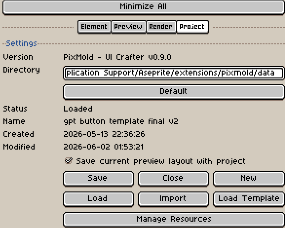
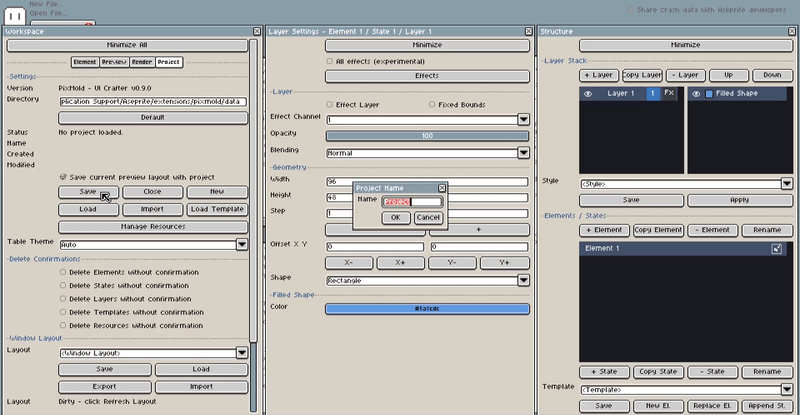
When you first open PixMold, go to the Project tab of the Workspace.
This is where you create (by using save a first time), save, load, close, and manage PixMold projects. The Directory field is normally filled automatically, so you usually do not need to change it for a first project.
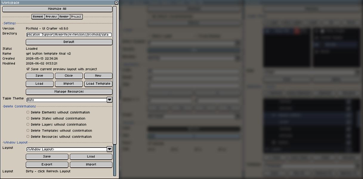
Project actions
| Action | What it does |
|---|---|
| Save | The first save asks for a project name and creates a project directory if no project is open. After that, it saves the current changes to the active project. |
| Close | Unloads the active project directory but keep its content. After closing, saving again can be used to save the current work under another project name. |
| New | Clears the current PixMold data and starts from an empty workspace. Save first if you want to keep your current work. |
| Load | Opens a file chooser. Select the project folder, then choose its project.json file. |
| Import | Brings data from another project into the current one. This is useful later for reusing styles, templates, presets, or resources. |
| Load Template | Opens the starter-pack chooser. Starter packs are editable examples that you can inspect and reshape. |
| Manage Resources | Opens the resource manager for loaded templates, presets, previews, layouts, color variations, and project assets. |
| Table Theme | Changes the plugin table display style. This affects the PixMold interface only, not your assets. |
For a first project, you mostly need Save, Load Template if you want to start from an example, and Load if you already have a project.
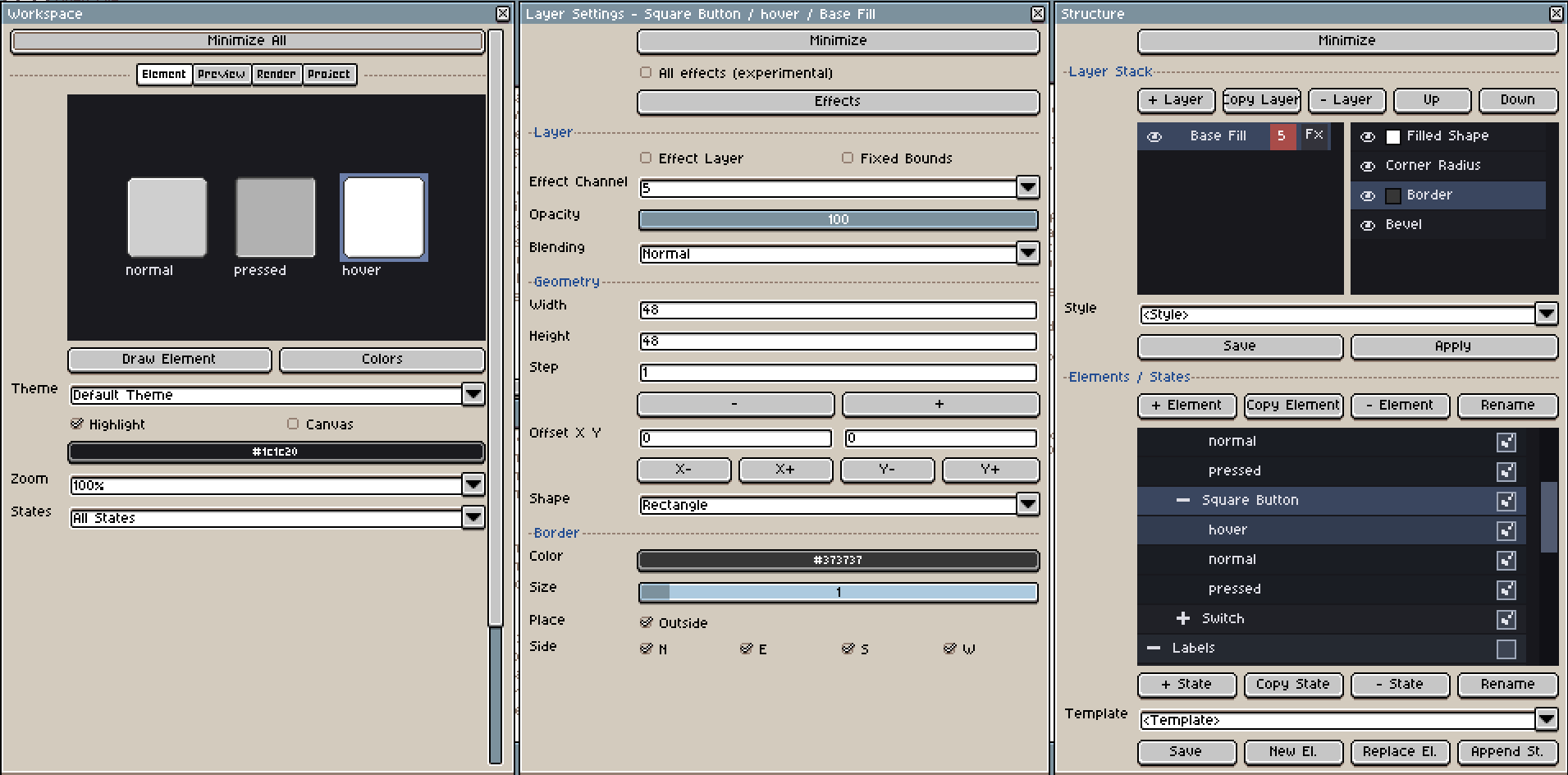
Main windows
PixMold uses several windows because UI creation often involves structure, parameters, preview, and resources at the same time.
You do not need to understand every window immediately. For the first workflow, remember this:
- Structure selects what you are editing.
- Layer Settings changes the selected layer.
- Effects adds or manages rendering effects.
- Workspace previews, renders, and manages the project.
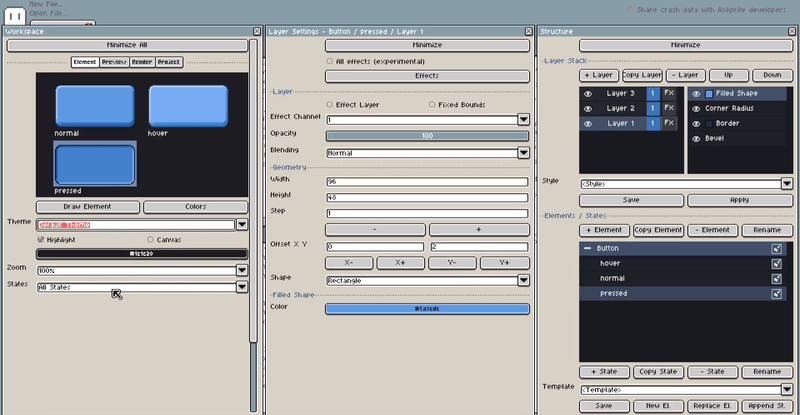
Workspace
The main preview and project window.
Use it to preview elements and states, test composed preview layouts, render sprite-sheet style outputs, and manage project settings.
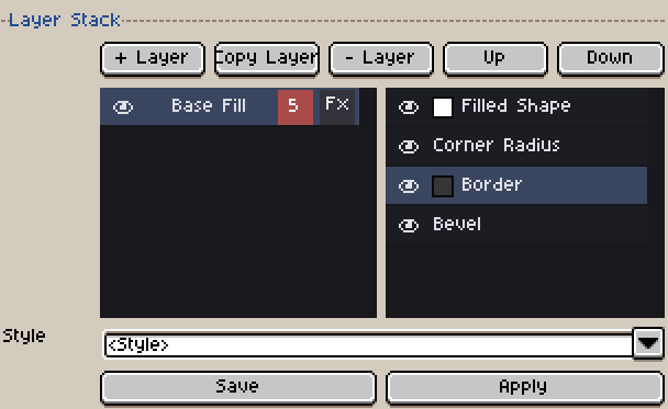
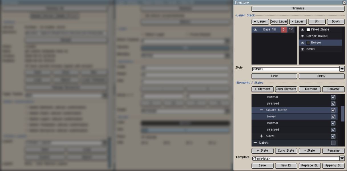
Structure
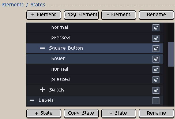
The hierarchy editor.
Use it to create and organize folders, elements, states, and layers. This is where you duplicate elements, add states, reorder layers, toggle visibility, and select what you want to edit.
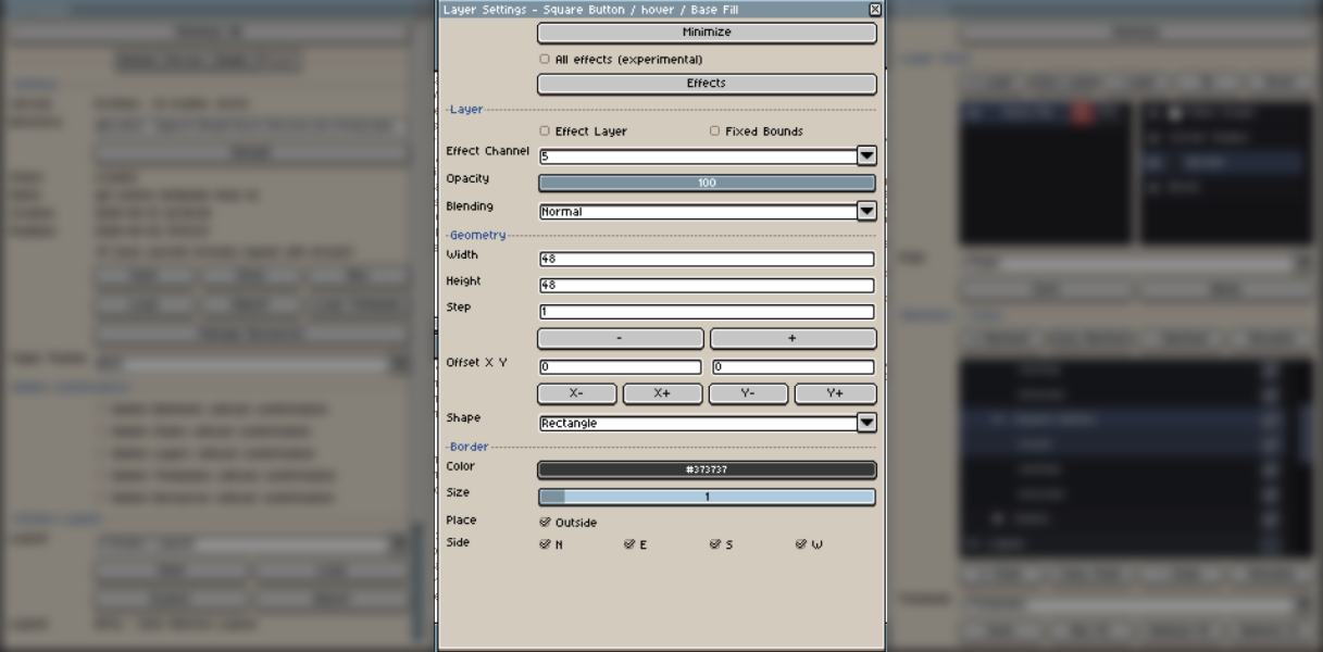
Layer Settings
The parameter editor for the selected layer.
Use it to change size, offsets, shape type, source settings, opacity, blend mode, and active effect parameters.
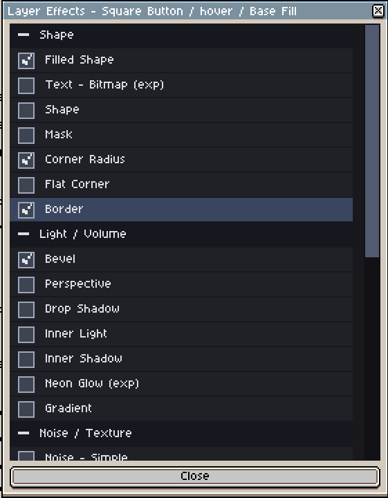
Effects
The effect browser and active-effect list.
Use it to add effects to the selected layer, enable or disable them, and switch between effect categories.
Preview Colors
A helper window for checking and editing colors used in the current preview.
It can show where a color appears and lets you jump back to the related element or layer.
Manage Resources
The resource manager.
Use it to review loaded styles, element templates, noise presets, preview templates, window layouts, color variations, and project assets.
Create your first element
The fastest way to understand PixMold is to create a simple button.
- Open PixMold in Aseprite.
- Go to the Project tab.
- Click Save and create a new managed project.
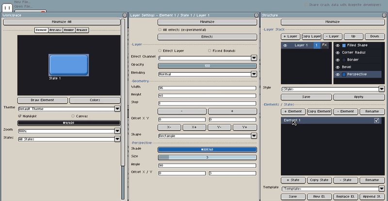
- Add a border, bevel, and perspective effect to the default element.
- Tweak the effect parameters until the button has a first usable look.
At this point, if you save the project, the button will stay editable. You can return to the project later and change its size, colors, bevel, border, effects, or layer setup.
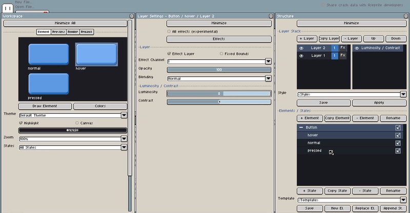
Add state and tweak “hover”
Most UI components need more than one visual state.
For a button, a common first set is: Normal, Hover, Pressed, Disabled.
- In Structure, double-click the default element and rename it
Button. - Click Copy State to duplicate the default state.
- Rename the original state to
Normal. - Rename the duplicated state to
Hover. - Repeat the same sequence to create a
Pressedstate. - Select the
Hoverstate and create a new layer. - Enable Effect Layer for this new layer.
- Activate the Luminosity effect and tweak it to create a brighter hover state.
Tweak “pressed”
- Select the
Pressedstate and repeat the same idea with a darker tone. - Now create a stronger pressed effect by changing the button depth.
- Deactivate Perspective on the pressed state.
- In the Bevel settings, select the bottom-right light direction.
- Because Perspective changes the element height, create a new layer to keep all states aligned.
- Enable Fixed Bounds on this new layer.
- Set the height of the fixed-bounds layer to
51so every state keeps the same frame size. - Select
Layer 1and adjust its Y offset so the pressed sprite stays aligned to the bottom.
Preview and Render
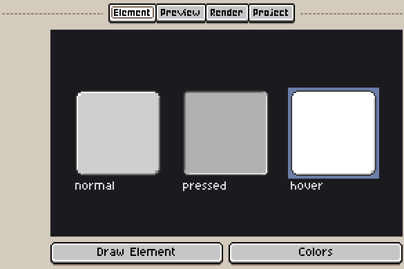
- To preview the result, go to the Element tab in the Workspace.
- Select States, then enable Single State.
- Click between
Normal,Hover, andPressedto check how the button behaves. - When the states look correct, go to the Render tab.
- Use Draw to New Sprite to render the states into a new sprite sheet.
- Save the project again if you want to modify the button later.
You do not need to rebuild each state from scratch. Start from an existing state, duplicate it, then change only what makes the new state different.
Where to go next
After this page, the most useful sections are:
- Project management for saving, loading, importing, and managing resources.
- Elements, states, and layers for the full editing model.
- Layer settings for geometry, sources, masks, and layer behavior.
- Effects for borders, bevels, gradients, shadows, noise, textures, and decoration.
- Preview templates for testing generated UI in context.
- Render and export for sprite-sheet style output.