Tips
Tips
Small workflow habits that make PixMold projects easier to edit, theme, preview, and export.
Use these tips as quick workflow references while building reusable UI components.
Working with previews
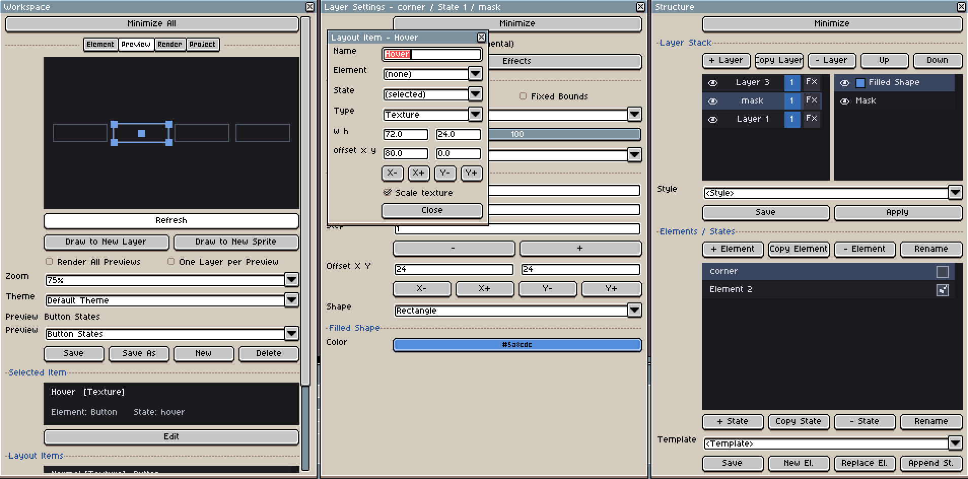
Preview templates let you test how your UI components work together without manually rebuilding the same presentation every time. You can create a preview layout, then quickly attach elements to it to check spacing, states, color themes, and composition.
Layout items are the building blocks of a preview template. They let you add, remove, copy, reorder, and select the pieces used by the preview.
Use this list to build a composed screen from several PixMold elements, such as panels, buttons, inventory slots, headers, or decorative frames.
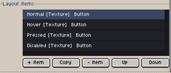
To edit a layout item, select it and click Edit. A modal opens where you can attach an element, choose its state, change the item type, and adjust its slice or layout settings.
On the preview canvas, the selected item is highlighted. You can then move it manually, resize it, and use the canvas to tune the final layout visually.
Working with text
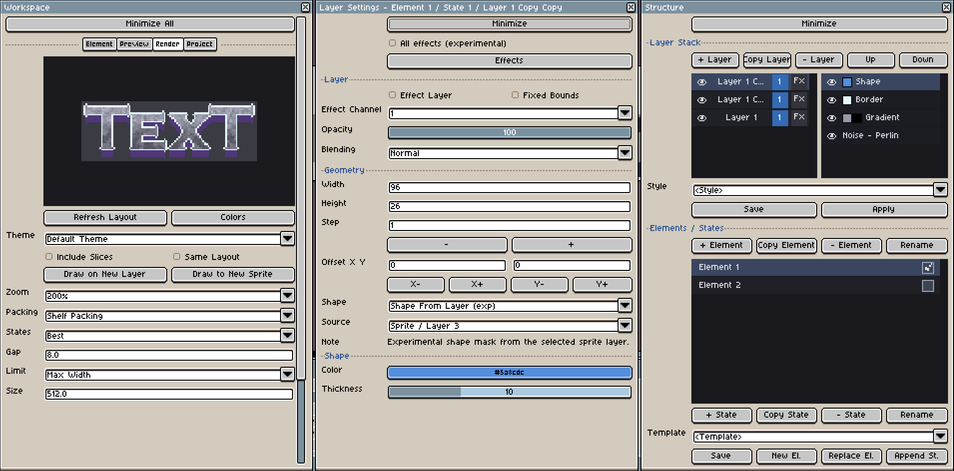
PixMold includes a basic Text effect, but it is mainly intended for fast previews and placeholder labels.
For production text, use Aseprite text as the editable source, then let PixMold style the result.
- Create the text with Aseprite’s native Text tool.
- Adjust the font, size, spacing, and position in Aseprite.
- Keep a copy of the original text layer if you may need to edit the wording later.
- Use Shape From Layer in PixMold to turn the text layer into a stylable shape.
- Apply effects such as Border, Bevel, Shadow, Gradient, or Luminosity.
This gives you more control than the temporary text effect, while still letting PixMold handle reusable styling.
(none). Select the original sprite that contains the source layer, then relink the layer in the effect settings.Working with noise
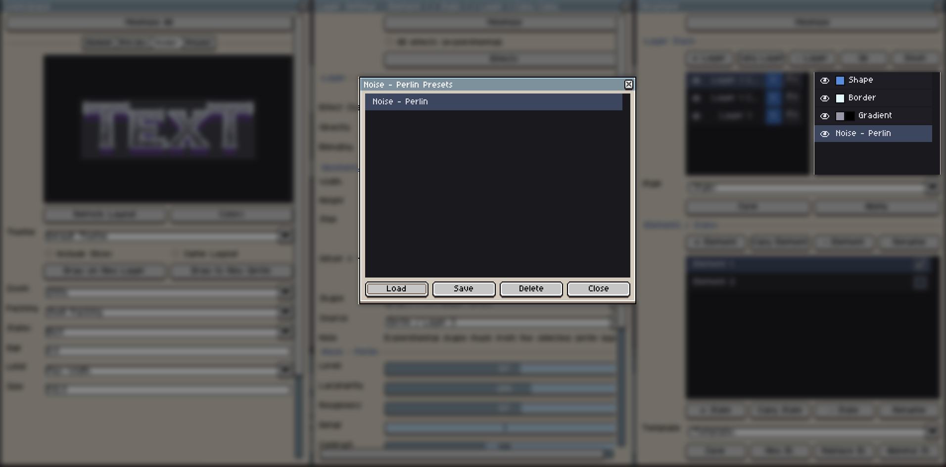
Noise effects are useful for wood, stone, dirt, metal variation, worn surfaces, cloudy gradients, and subtle texture overlays.
Save presets when you find a material setup you want to reuse.
- Open the layer that uses a noise-based effect.
- Right-click the noise entry or noise effect in the effect list.
- Use the context menu to Save Preset or Load Preset.
Noise performance
Large surfaces and complex effect stacks can take time to update through Aseprite scripting. PixMold may still be working even if the interface does not visibly change immediately.
- Start on a smaller surface first.
- Tweak the noise values until the material feels right.
- Save the noise preset or layer style.
- Apply the saved style to the larger final surface.
- Render large outputs only after the look is mostly stable.
Organizing elements
Use folders in the Structure window when a project starts to contain many buttons, panels, slots, frames, widgets, icons, or preview parts.
- Open the Structure window.
- Right-click in the element list to create a folder.
- Right-click an element to move it into a folder or manage its organization.
The checkbox next to an element marks it for rendering. Only enable the elements you actually want in the final output.
Copying layer styles
Use layer styles when several layers need the same border, bevel, shadow, gradient, noise, or material treatment.
- Select the layer that already has the effect stack you want to reuse.
- Save its layer style.
- Select another layer.
- Apply the saved style to copy the effect setup.
Reusing complete elements
For complete components, use templates or element duplication. This is useful for buttons, switches, toggles, tabs, checkboxes, sliders, and any component with multiple states.
- Create a clean base element, such as a
ButtonwithNormal,Hover, andPressedstates. - Save it as a template when you want to reuse it in other projects.
- Use Copy Element when you only need a quick variation in the current project.
- Modify the duplicated element instead of rebuilding the full state structure from scratch.
Working with the custom color picker
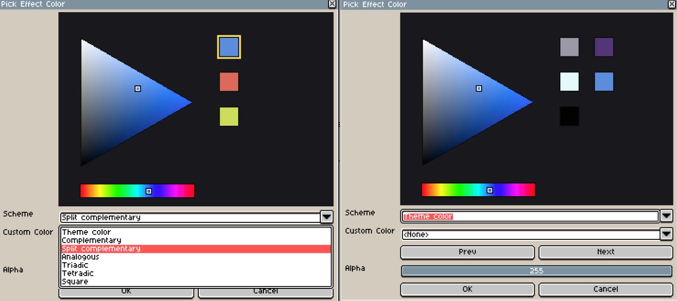
The custom color picker shows Theme Colors by default. This list contains colors currently used by PixMold or by the active project, depending on the context.
Use it to quickly reuse existing colors instead of picking them again manually.
The color picker can also help you explore color schemes:
- complementary colors;
- analogous colors;
- lighter or darker variations;
- quick palette adjustments.
This is useful when you want to test a different mood for a component without rebuilding its layers or effects.
Working with color themes
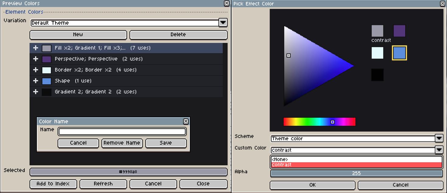
The Color Theme window lists the colors used by your current project or preview. You can use it to see where each color is used, update colors, and create named colors for more consistent UI work.
- Open the Color Theme window.
- Review the list of colors used in the current project.
- Select a color to see where it is used.
- Change the color if you want to update its appearance.
- Double-click a color to give it a name, such as
Primary,Border,Highlight, orShadow. - Use the custom color picker to select these named colors when building components.
- Create a new color variation to test another palette without changing the structure of the component.
Named colors are useful when several components should share the same palette. Color variations let you quickly preview different themes from the same UI structure.
Creating corner decorations
You can use a small element as a reusable corner decoration, then repeat it around a panel with Border Array.
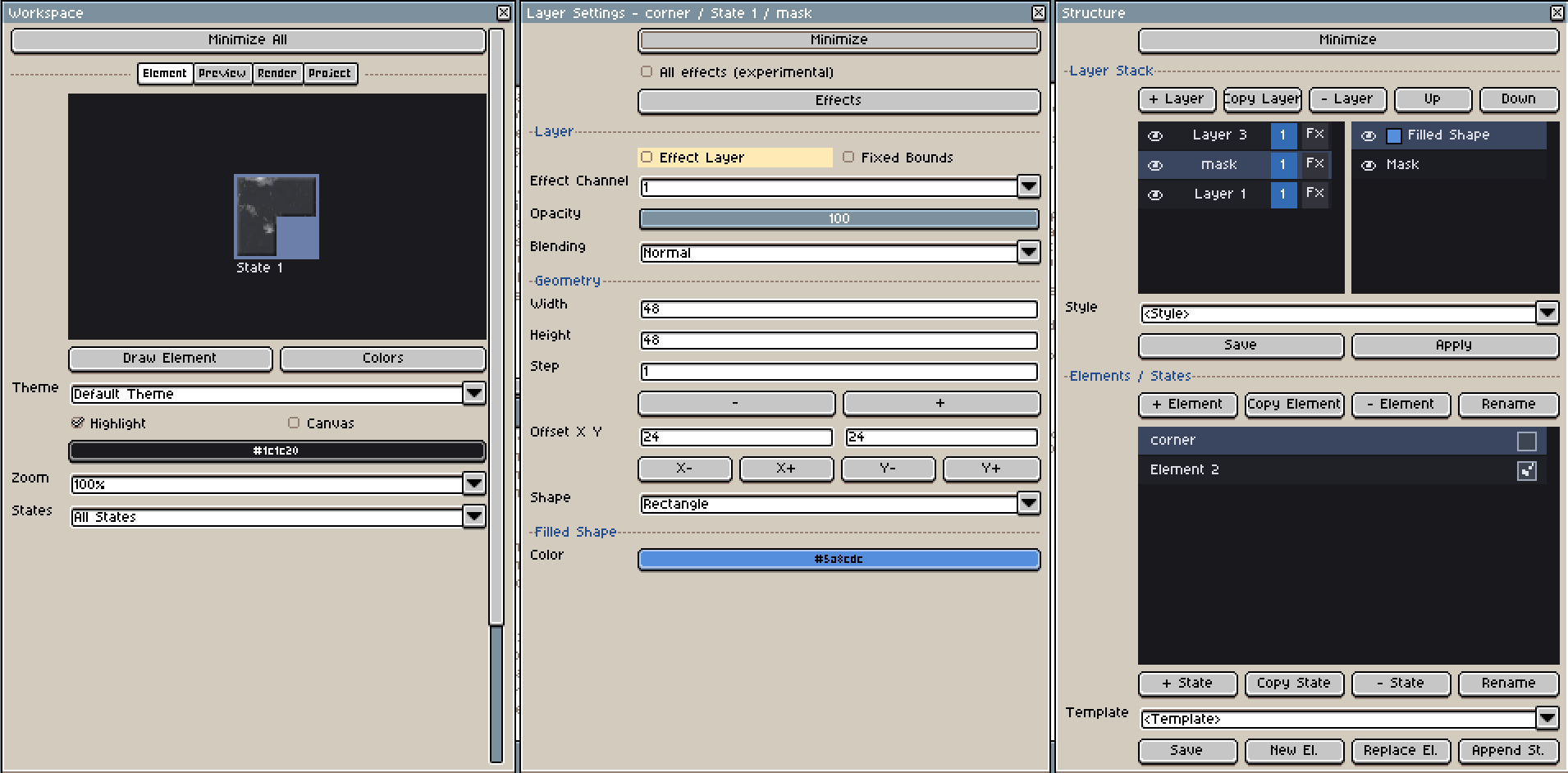
A simple corner ornament can be built from a few layers:
- Create a new element for the corner decoration, for example
Corner_L. - Create two layers with the same size, for example
48 x 48. - Use one layer as the base shape.
- On the second layer, add a Mask effect.
- Set the mask offset to
24on X and24on Y to cut the shape into an L-style corner. - Add a third Effect Layer if you want to style the result with border, bevel, shadow, gradient, or luminosity.
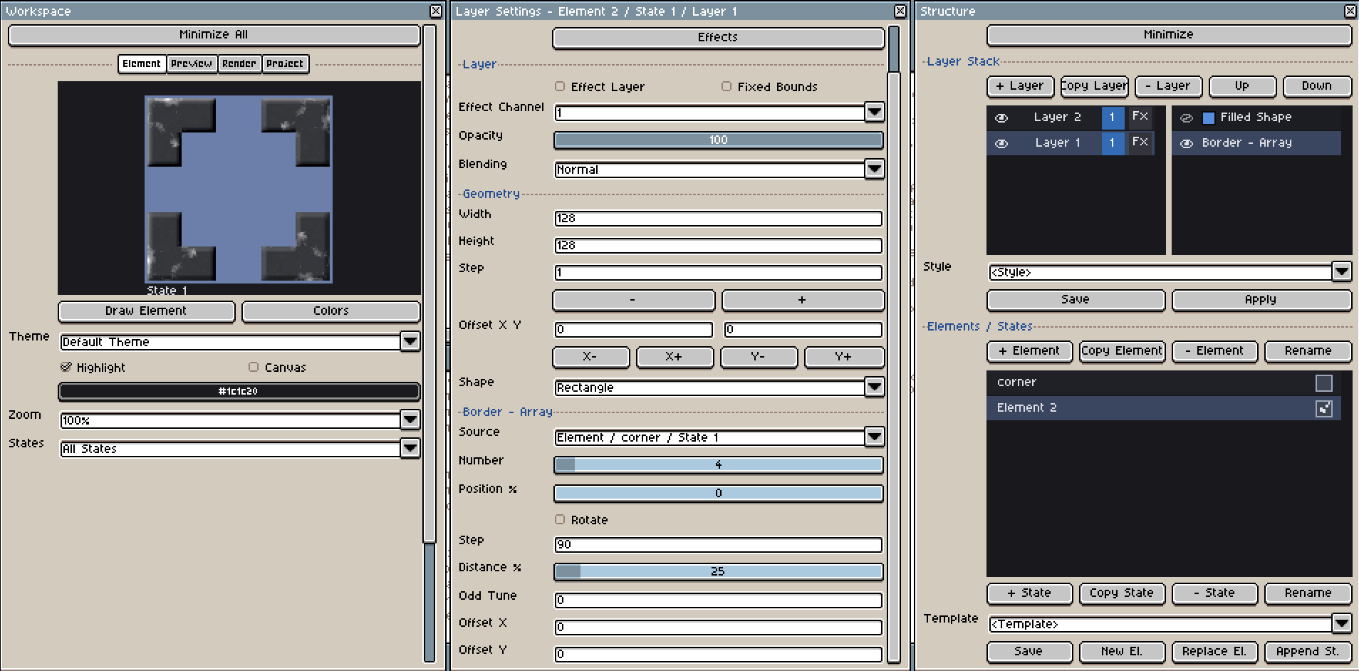
Once the corner element is ready, use it as a source for another element. In this example, a Bevel effect is added through an Effect Layer above the Border Array layer so the corner lighting stays coherent across all repeated corners.
- Create or select the panel element that should receive the corner decorations.
- Add a Border Array effect.
- Use your corner element as the source.
- Set Step to
90to rotate the source by 90 degrees at each iteration. - Set Distance to
25%to place the repeated shapes near the corners. - Adjust Odd Tune if the rectangle needs correction on alternating corners.
- Add an Effect Layer with Bevel if the repeated corners should share the same light direction.
The Step value controls how much the source rotates each time it is repeated. With a value of 90, one L-shaped corner can be reused for all four corners.
For square shapes, 25% distance may place the corners correctly right away. For rectangles, two corners may align correctly while the opposite corners need adjustment. In that case, use Odd Tune to compensate for the rectangular proportions.